Steven Harrap
2D Media blog
Painting, Drawing - Painting and drawing scrap book of activity during 2D Media Processes at QUT
During 2007 I participated in a unit called 2D Media Processes at QUT that involved drawing, painting, printing etc. All good stuff that I had missed for so long. This is a scrap book of what I did each week. It records some lecture material, pictures, links and work that I created.
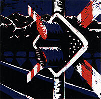
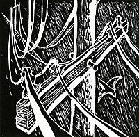
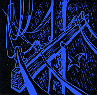
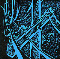
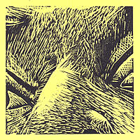
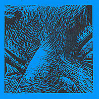
25th May 2007
Work produced this week
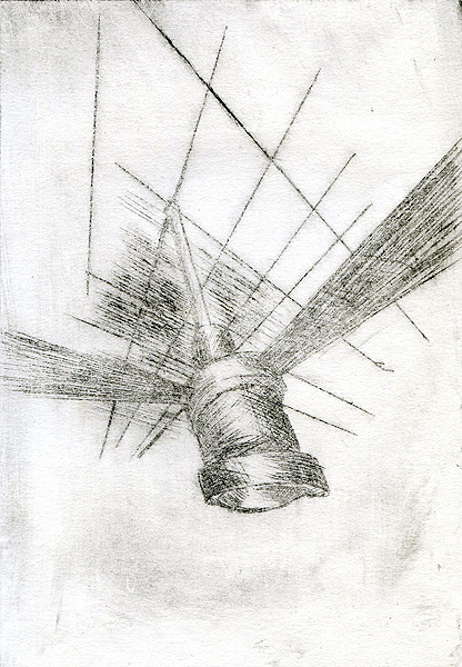
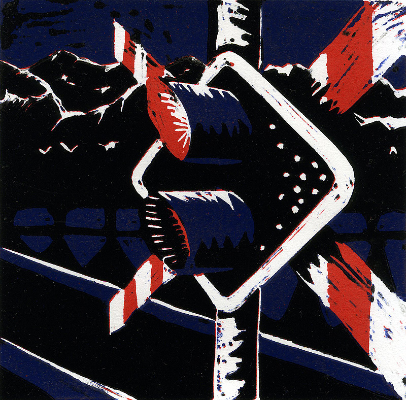
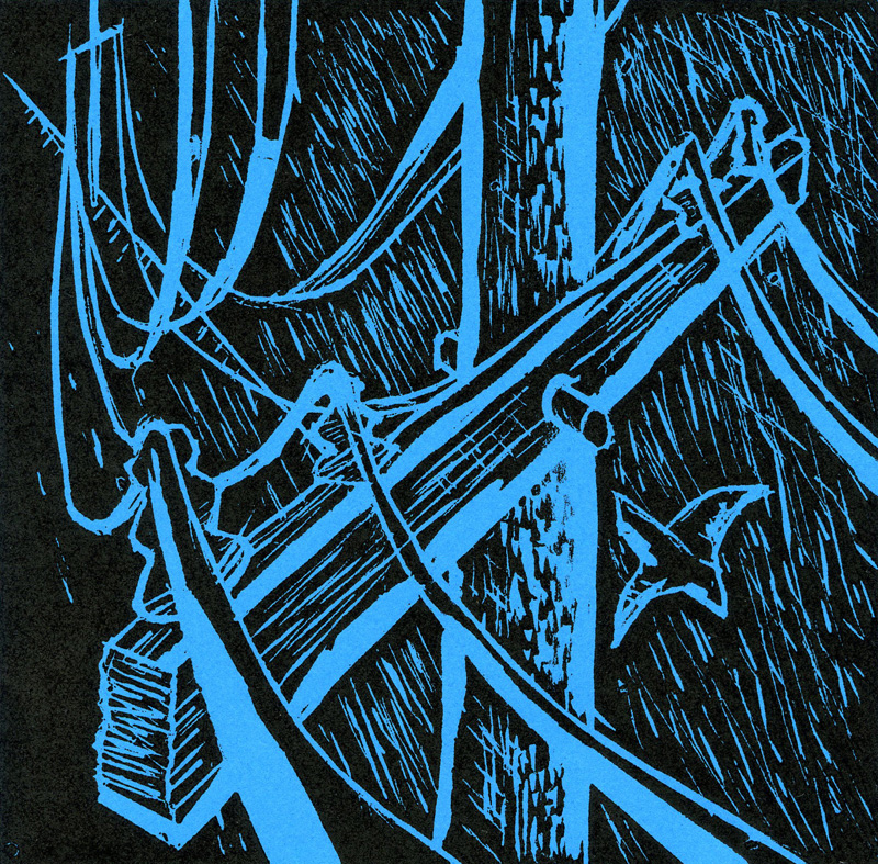
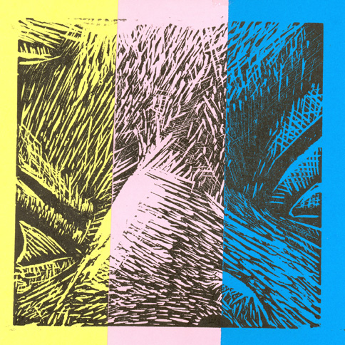
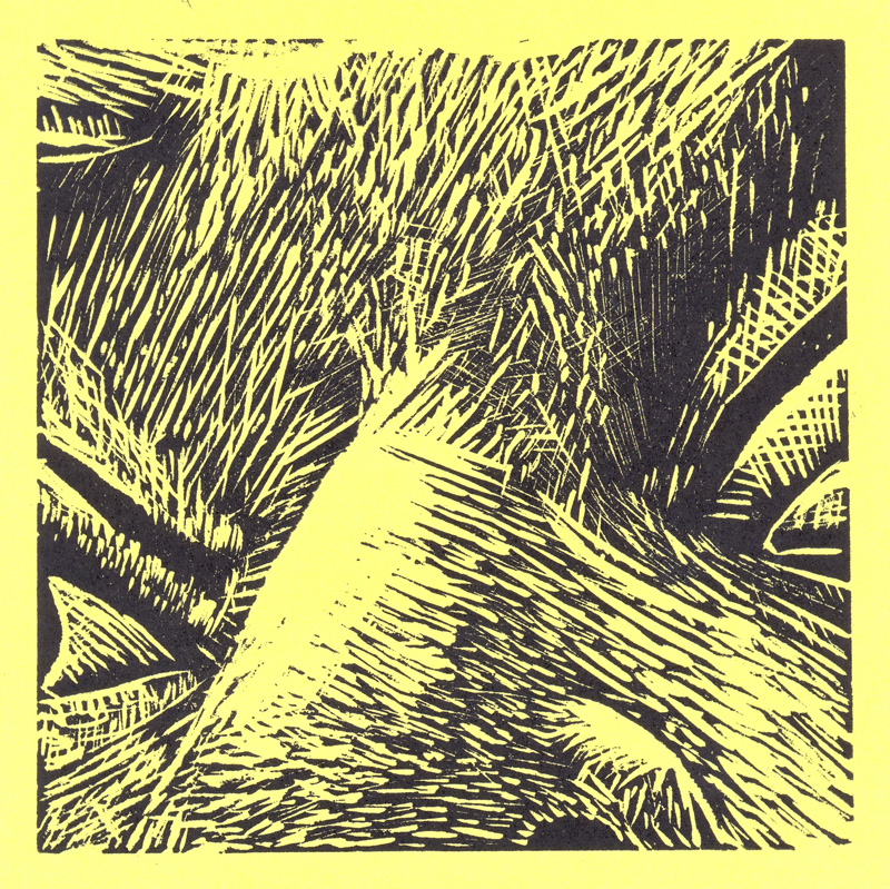
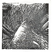
The 3 colour lino print from last week is finished and I managed a run of about 13 prints. Registration was not to crash hot but I think they came together pretty well for a first go.
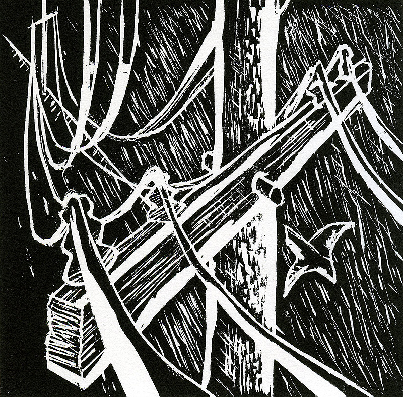
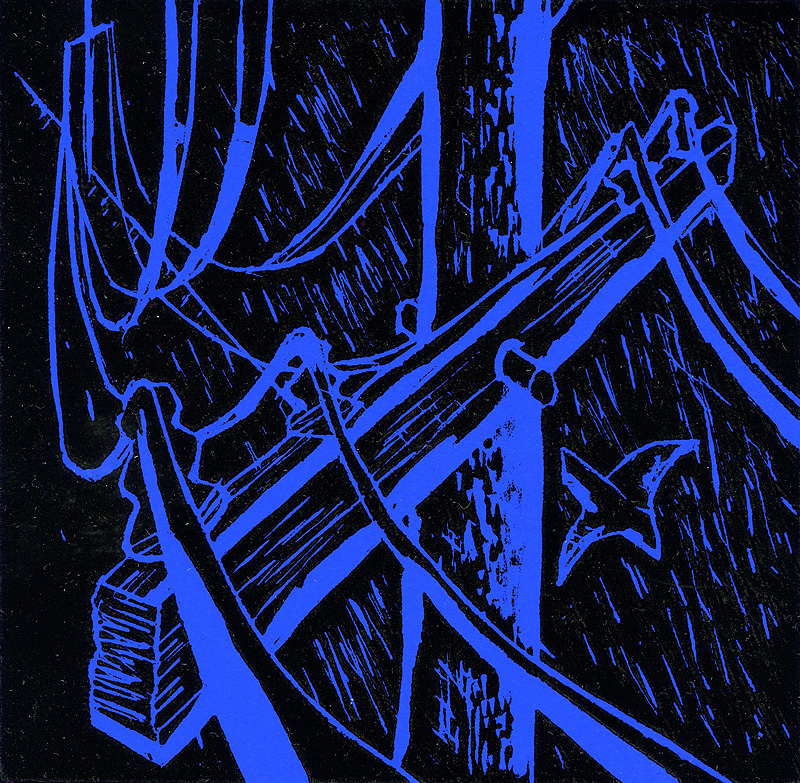
The prints of the telephone pole were done on a white block that could be etched in like lino but harder wearing.
Finally the light grey one is an etching in thin film - it's supposed to be a ceiling fan.
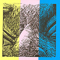
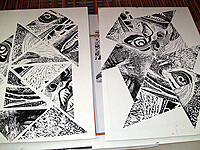
18th May 2007
Work produced this week
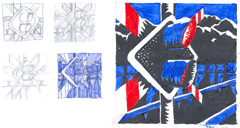
This is a 3 colour lino print to be printed on A4. This is a preview of the print as it is currently still halfway through the run. Hopefully it will complete and I'll have more here soon.
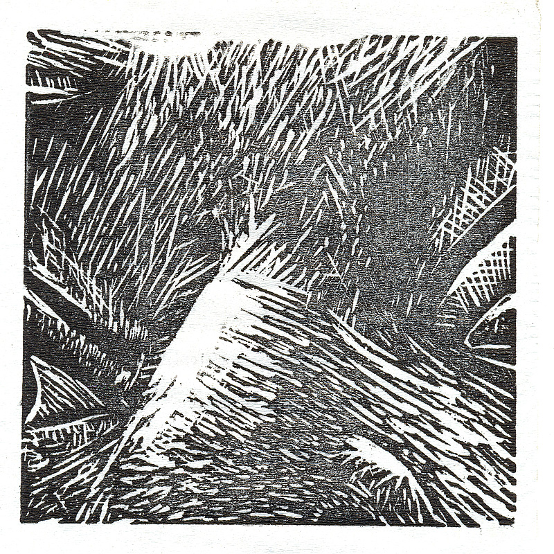
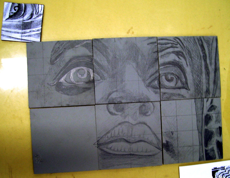
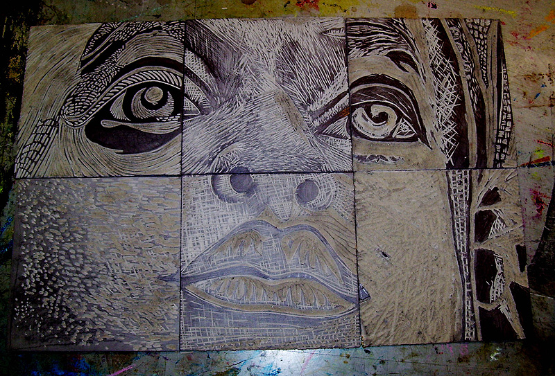
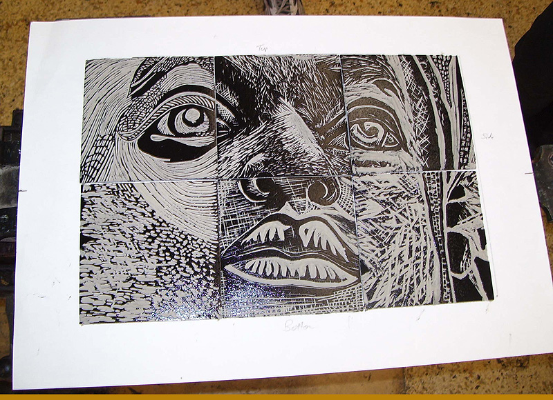
9th May 2007
Work produced this week
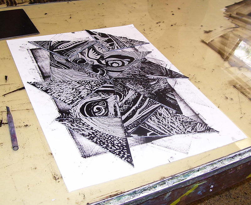
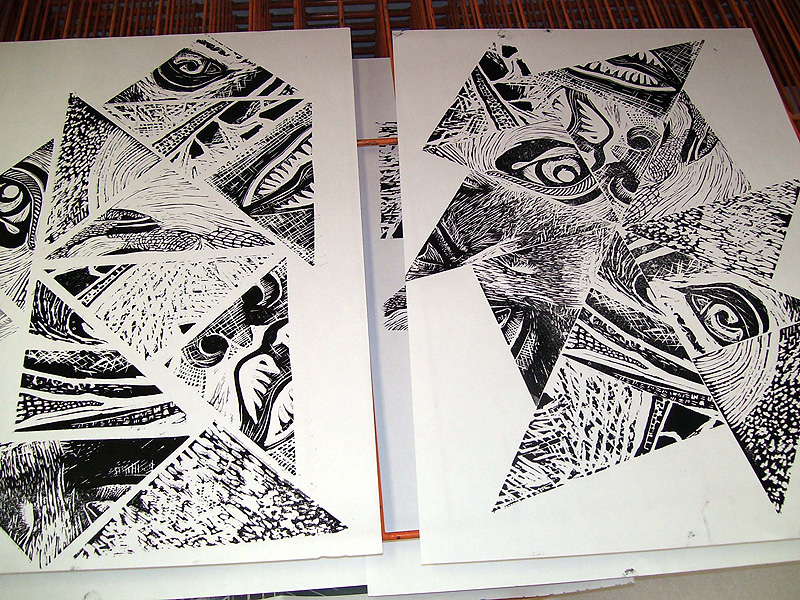
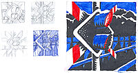
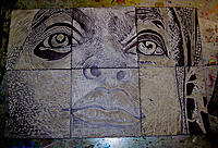
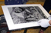
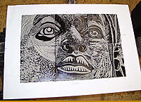
This week I started the printing stream of the unit. Beginning with a photo of a face we each took a square and cut it into lino. After reassembling the lino we printed several complete versions of the face on A2 paper. I printed several version of my section on coloured A4. Finally we sliced the lino cuts and did several "jumbled" versions.


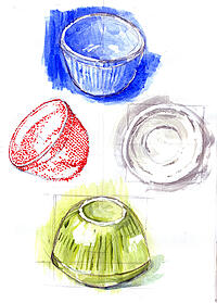
2nd May 2007
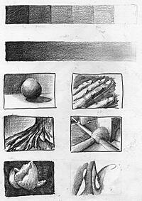
Work produced this week
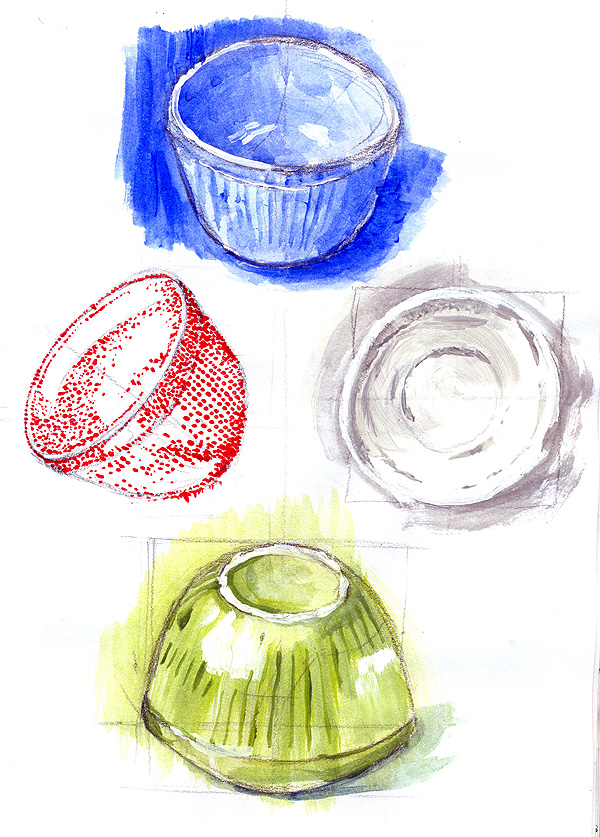
Depicting a bowl using four distinct methods of painting.
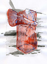
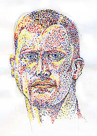
18th April 2007
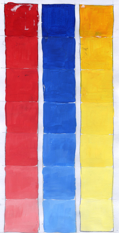
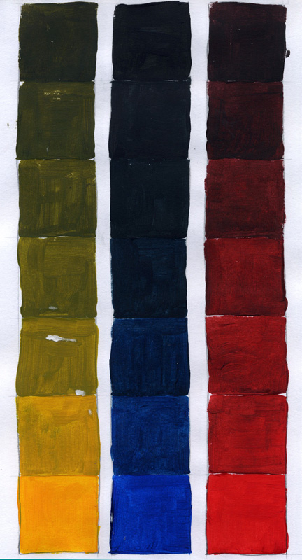
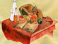
Work produced this week
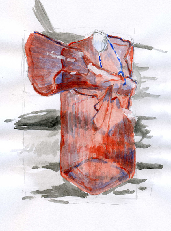
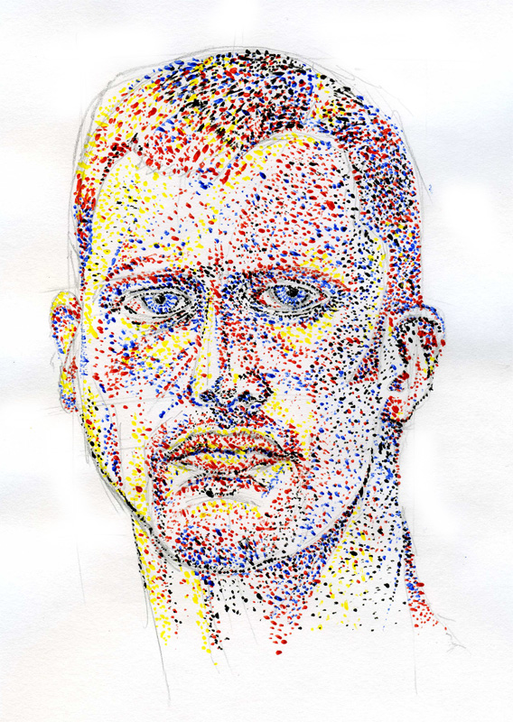
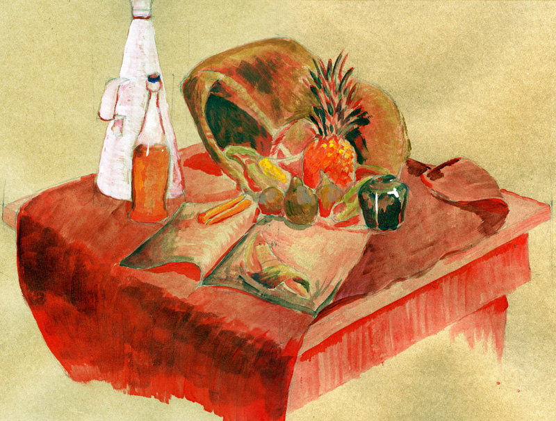
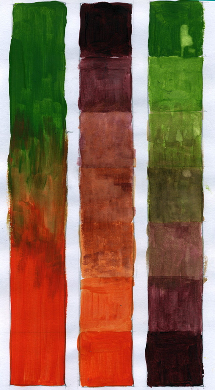
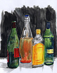
My portrait uses only red, blue, yellow and black to create a pointillist style work. The pink bottle is a monochrome work. The table scene starts from a monochrome work in red and builds colour on top.
4th April 2007
Work produced this week
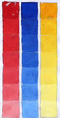
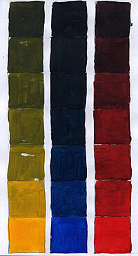
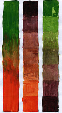
Notes of interest from this weeks lecture
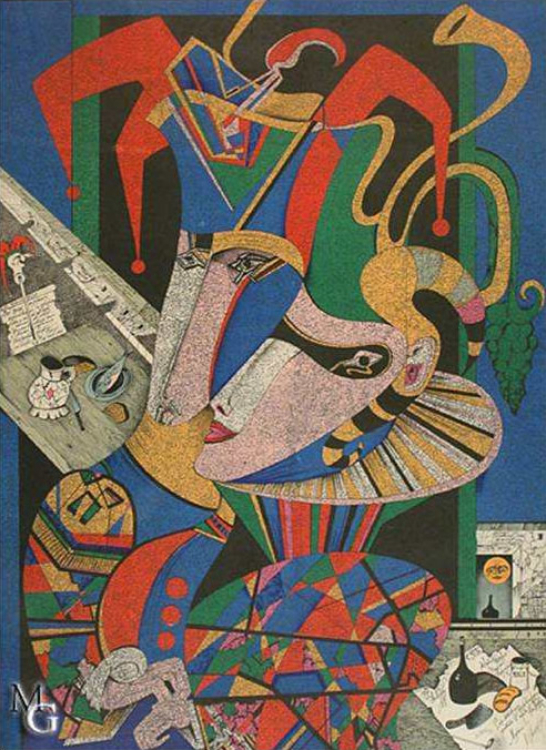
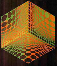
Colour theory, colour wheels, complementary colour, secondary colour - you name it - it's colour. These took my eye from the lecture. The madness of the top right is brilliant and the swirling line of the middle of bottom is incredible.
Here's a bit of colour wheel theory
- Monochrome: A single colour used, varied in saturation and lightness for several different contrasting shades.
- Analogous: Here you use the colour wheel to pick to colours that are side-by-side. One become the dominant colour and the other is used to accent.
- Complimentary: Using the colour wheel, complimentary colours are found opposite each other. This creates high contrast
- Split complimentary: Same as complimentary, however you would also use the two colours either side of the secondary complimentary colour.
- Triadic: Uses any three colours which form a triangle on the colour wheel, equally spaced apart.
- Tetradic (or double complimentary): Pick a complimentary pair of colours, then a second paint to use in tandem.

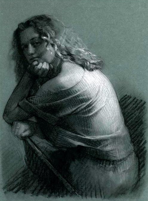
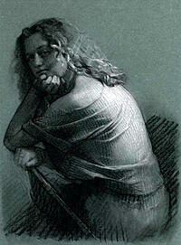
28th March 2007
Work produced this week
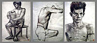
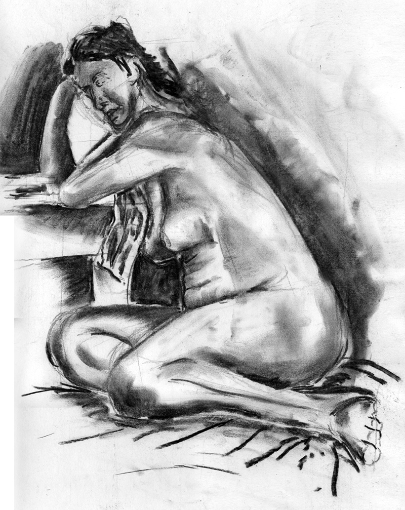
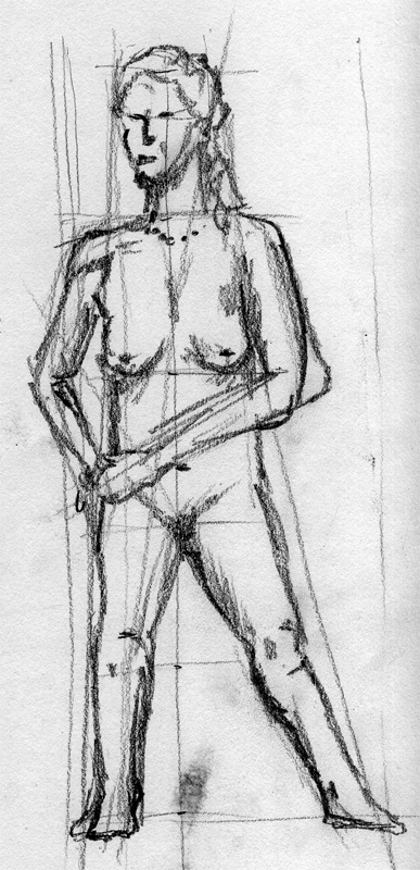
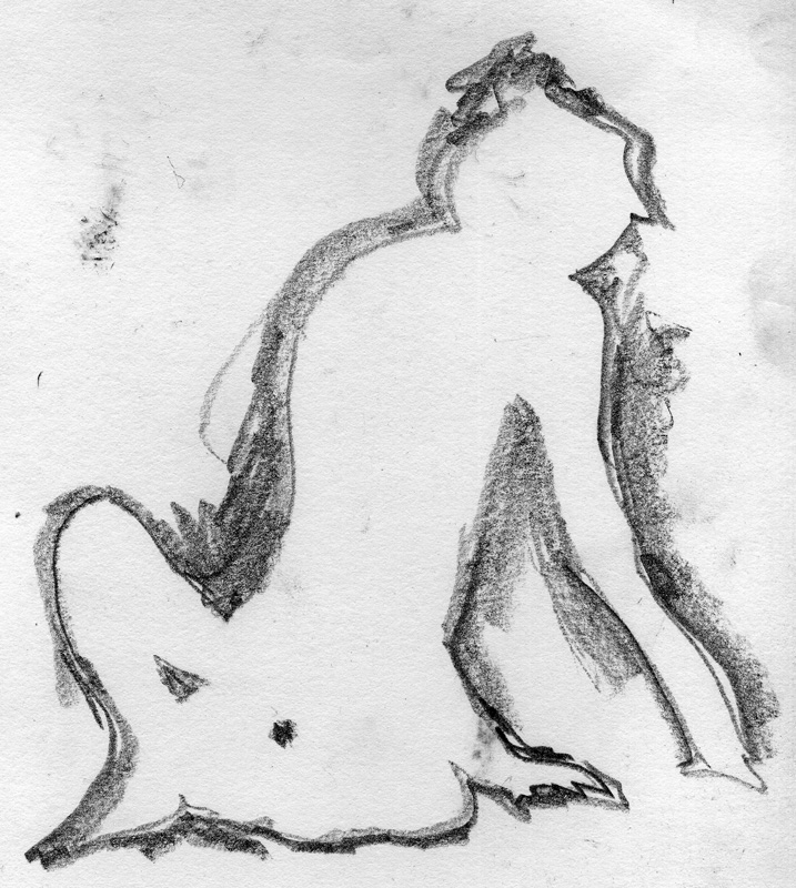
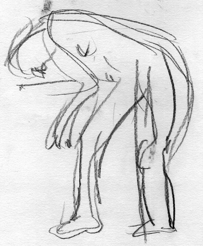
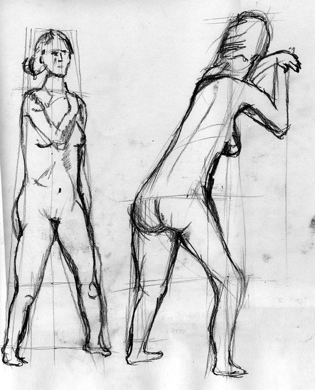
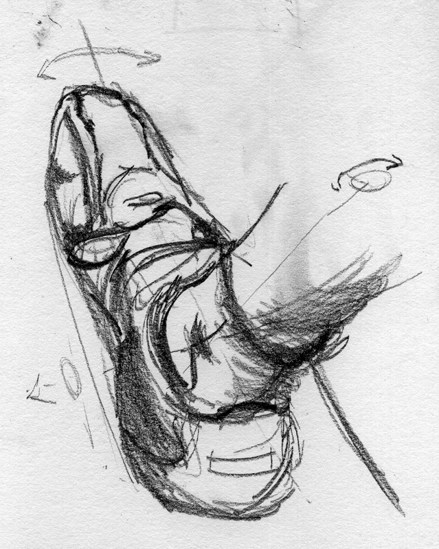
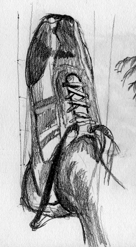
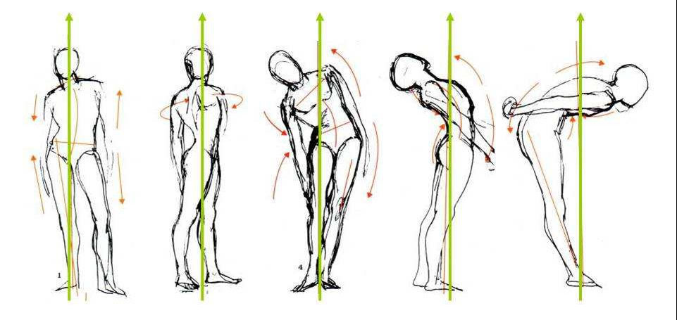
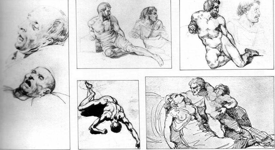
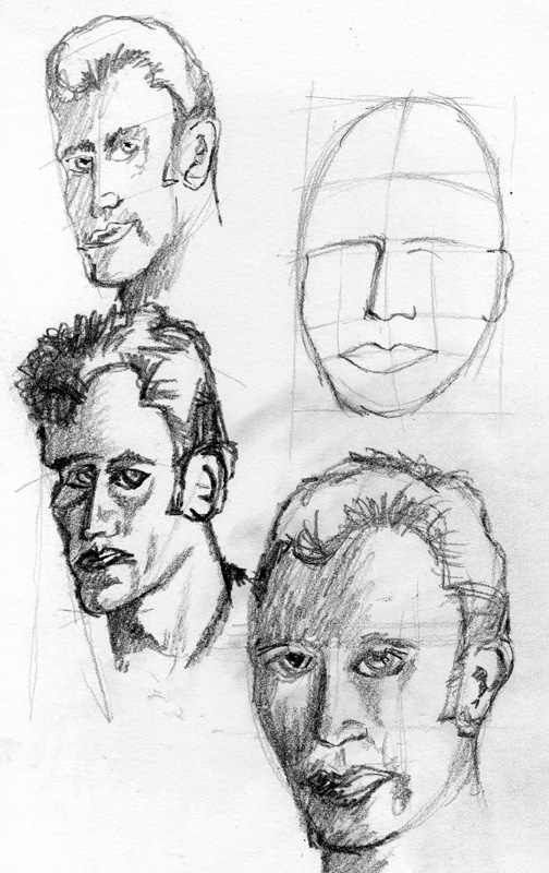
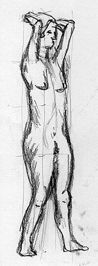
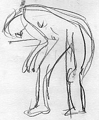
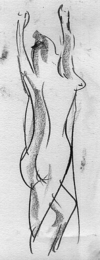
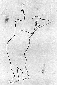
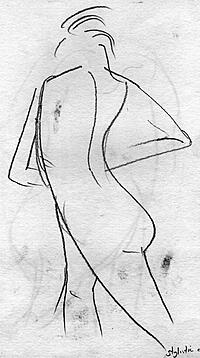
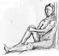
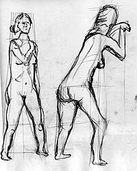
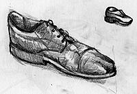
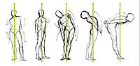
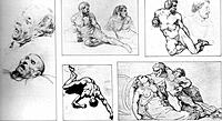
Figure sketching involving short and longs period sketching in charcoal and pencil. Also some sketches of my shoes.


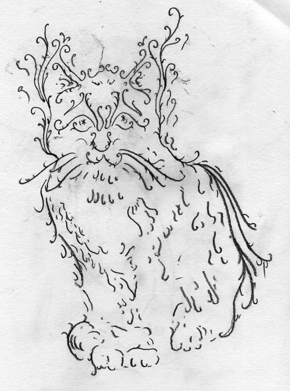
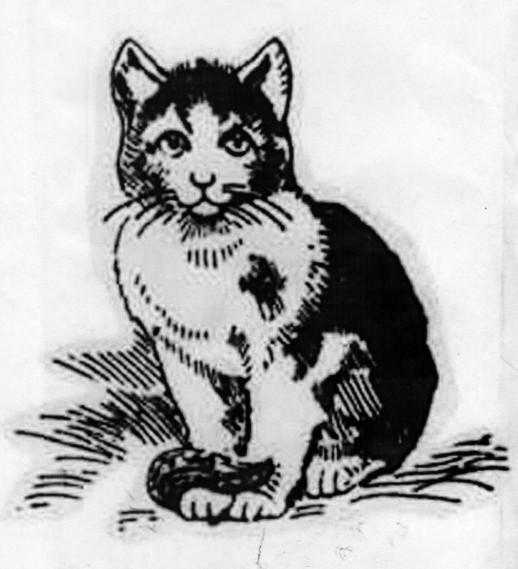
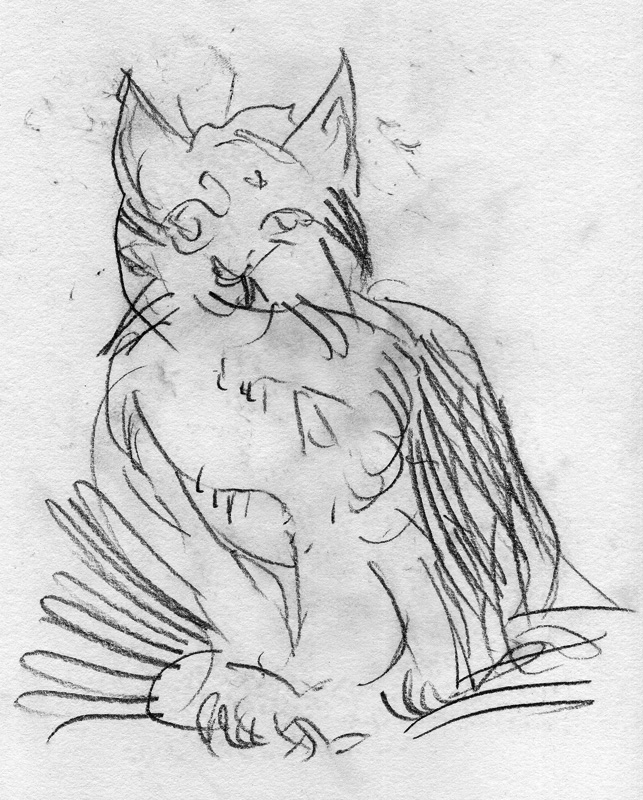
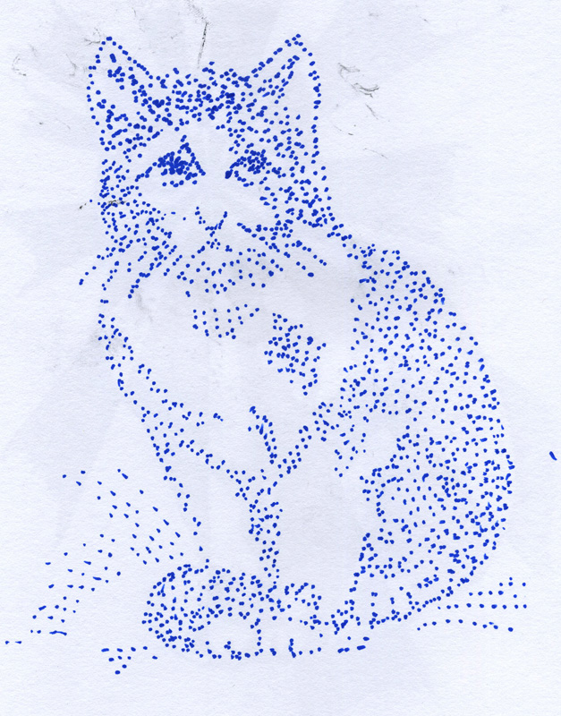
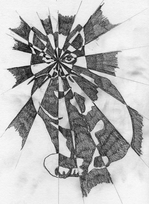
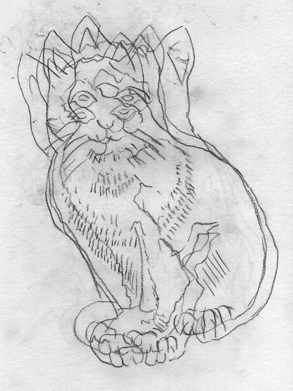
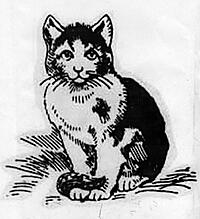
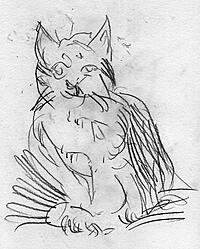
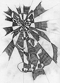
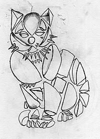
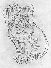
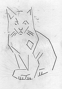
Variations on a cat. The first picture is a scanned from a book. The following are abstractions of the image.


Notes of interest from this weeks lecture
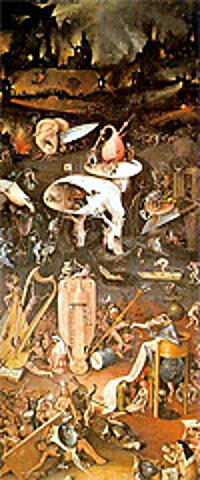
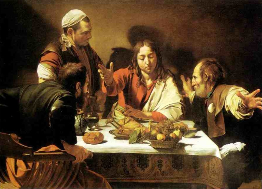
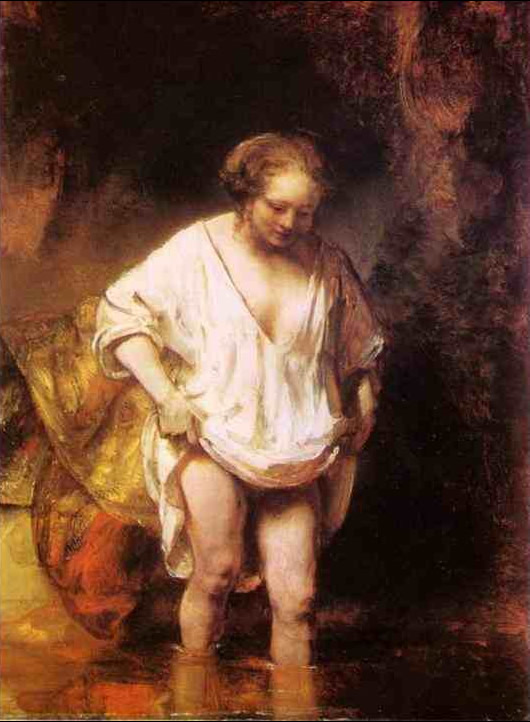
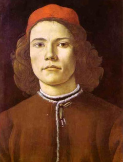
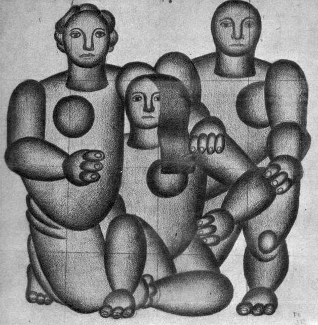
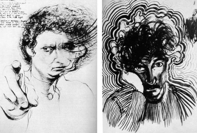
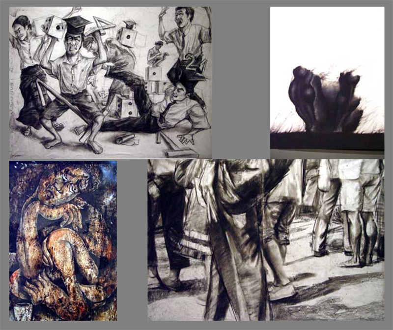
Figure drawing by the boat load. And all its various abstractions. Checkout http://www.tate.org.uk/ for some brilliant and loopy inspiration. Some fascinating interviews with the movers and shakers.
This week we were also introduced printing. Not that its a new subject just that we'll be split into tiers either doing printing, movies or multipls(?). I'm quite taken by the idea of printing and these have spiked the notion.
21th March 2007
Work produced this week
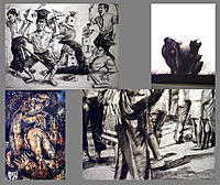
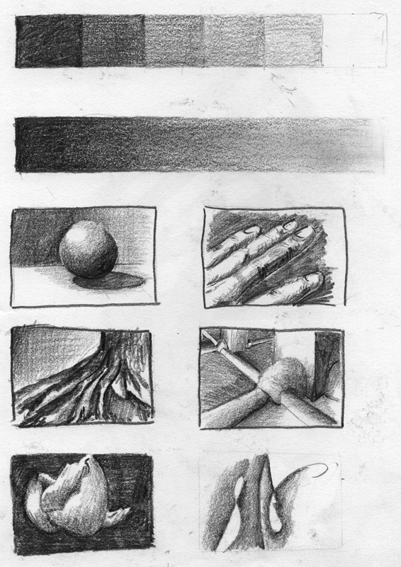
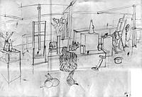
As a group our class was set the task of sketching a large still life on one, long, piece of paper. The media was charcoal and chalk. These are the pieces that I completed.
Notes of interest from this weeks lecture
If your scratching your head for a decent colour set try here: http://kuler.adobe.com/. I was a bit suspicious (or to be honest - plain disinterested) but after having a look I'm getting a few ideas for the site.

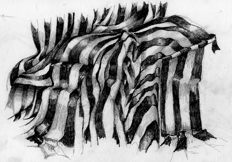
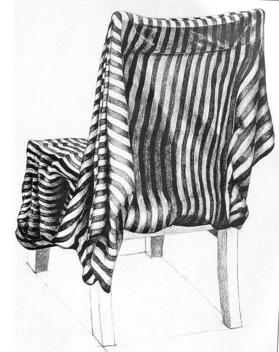
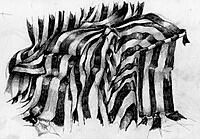
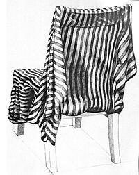
14th March 2007
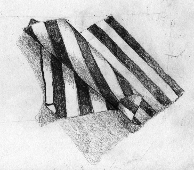
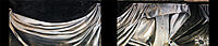
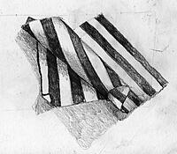
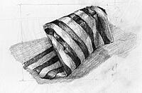
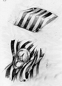
Work produced this week
Small sketches of striped fabric in scrunched up arrangements.
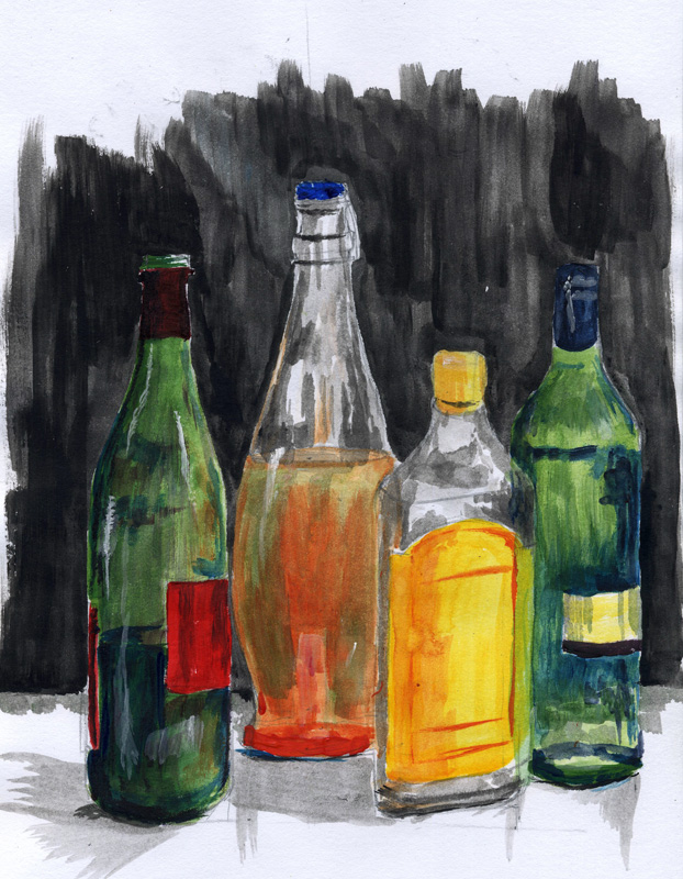
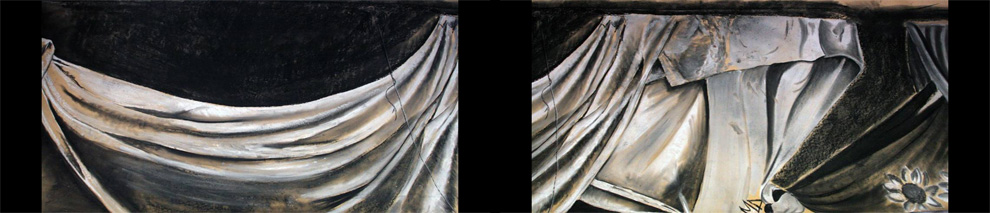
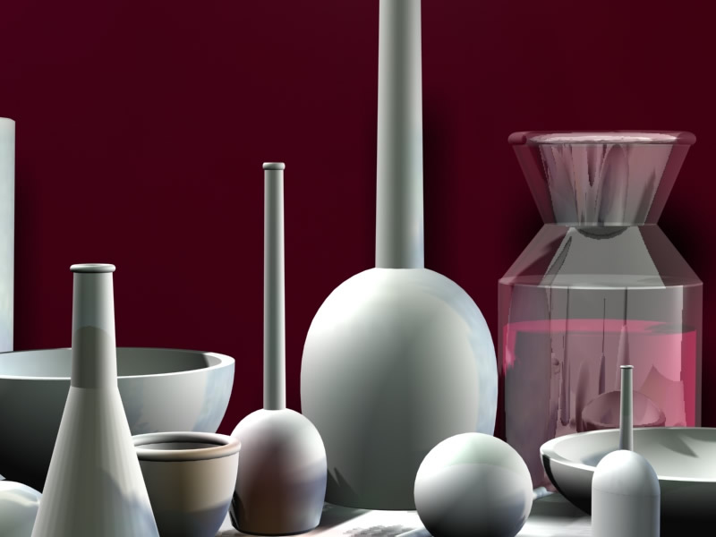
Notes of interest from this weeks lecture
Beautiful use of shade to produce form. The bottles are computer generated so they are fairly sterile but still...
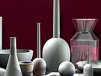
7th March 2007
Work produced this week
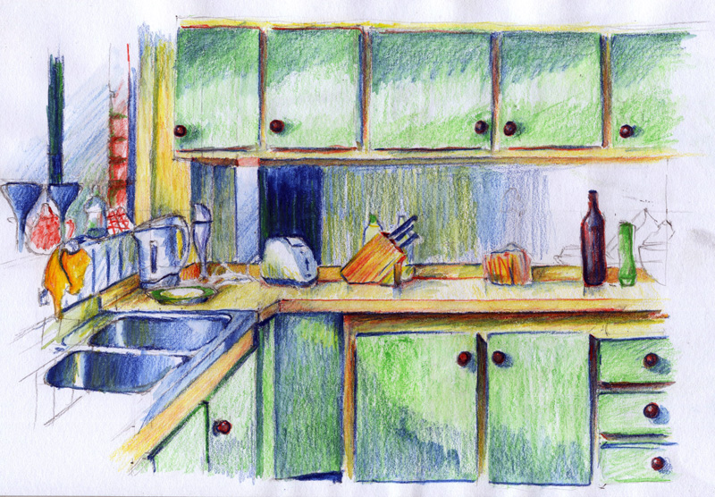
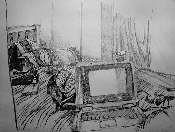
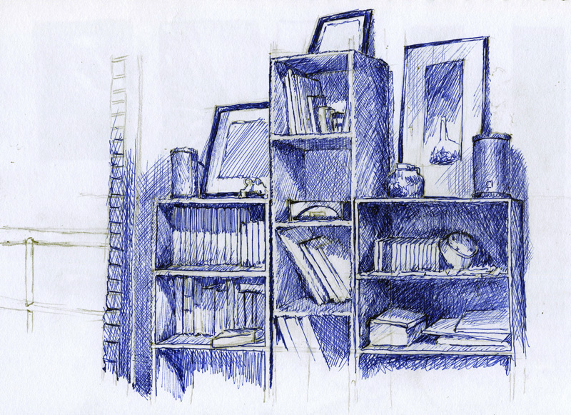
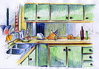
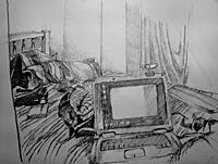
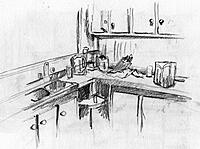
Still life sketch in the studio at university. It turned out pretty well but my little web-cam does it no justice. I'll take a better pic when I get my hands on a digital camera. Homework was to sketch scenes from my home - this is the kitchen.
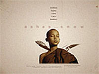
Notes of interest from this weeks lecture
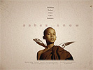
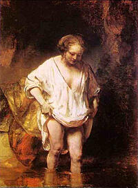
Check out "Ashes and snow" (child to the left) - a very neat photographic flash installation.

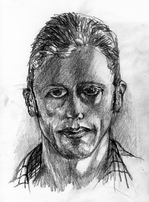
1st March 2007
Work produced this week
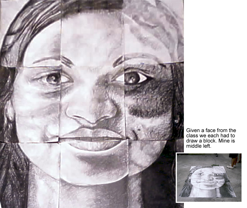
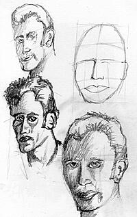
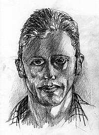
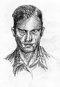
Taking a photo of a face, dividing it into 9 equal squares and giving each square to a person. Each person then copies the square using pencil onto a piece of A2 paper. There result is something like this. My part was the left middle area. If you would like to see what the rest of the class produced click here to see a power-point presentation of their work. The other pictures are self portraits.

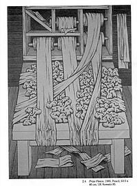
Notes of interest from this weeks lecture
These images were photographed by the lecturer in a drawing studio in Korea.
The most basic of visual elements are:
- the dot, a point in space
- the line, extension of a point. the articulator of form.
- value/ tone, the most basic of all elements, the presence or absence of light
- hue and saturation, the make up of color--coordination of value with added component of chroma
- texture, optical or tactile, the surface characteristic of visual materials
- scale, the relative size and measurement of an image/object
- dimension and motion, implied through techniques and devices
Principles
- BALANCE: Symmetrical / Asymmetrical /
- HARMONY in visual design is where the visual content relate to and complement each other
- COMPOSITION is the relationship among the elements of a visual form that helps all the elements function together and makes a complete whole
- EMPHASIS is the principle of design that causes one element or area of a visual image to be more important than the other parts to attract the viewers attention.
- SPACE positive and negative space is created through the arrangement of elements and objects in two and three dimensional space.
- MOVEMENT creates the illusion of action, motion, or physical change of position.
- VARIETY is the principle concerned with combining design elements that are different or contrasting.